Tech and Innovation

The IPCC reports emphasize that transparency and data accuracy are essential in global climate change mitigation efforts. Without a strong monitoring system, climate targets risk becoming nothing more than numbers on paper. This is where Measurement, Reporting, and Verification or MRV systems play a critical role.
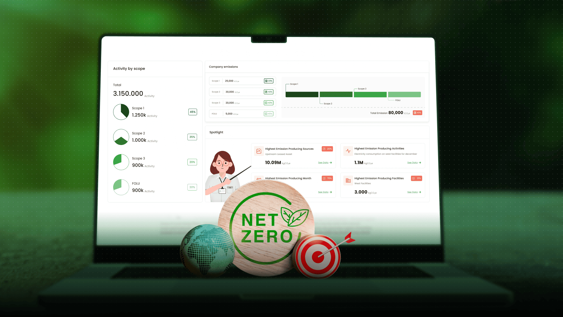
However, one major challenge often emerges in MRV implementation. What happens when large amounts of data are available, but cannot be understood quickly and accurately?
This is why spatial data visualization has become a fundamental component of modern MRV systems. Beyond simply displaying information, visualization helps organizations understand project conditions comprehensively and make evidence-based decisions.
According to the World Bank, an effective climate transparency system requires data that is accessible, verifiable, and understandable to multiple stakeholders. Data that only exists in spreadsheets or lengthy reports often slows down the decision-making process.
MRV without visualization is like a compass without a needle. Emission figures, project coordinates, land cover changes, and time series data may all be available, but they remain difficult to interpret as a whole.
Sustainability teams may understand the technical details, but what about management teams, investors, regulators, or other stakeholders?
Spatial data visualization provides context. Data no longer stands alone but becomes connected to location, time, and changing field conditions. Through interactive maps, trend charts, and integrated dashboards, data becomes clearer and easier to act upon.
In its transparency framework, the UNFCCC highlights the importance of reporting systems that are consistent and openly reviewable. Transparency is not only about data availability, but also about how easily the data can be understood.
Visualization helps accelerate human understanding of complex information. The human brain recognizes patterns more quickly through graphs and maps than through long rows of numbers.
When land cover changes are displayed through spatial layers over multiple years, trends in deforestation or vegetation recovery become immediately visible.
For carbon project auditors and validators, visualization also improves verification efficiency. Integrated geotagging data, field photos, and project coordinates strengthen report credibility.
Every claim becomes easier to trace visually. This improves transparency while increasing trust in the reported data.
The GHG Protocol emphasizes that the quality of emission inventories depends on data accuracy, consistency, and completeness. However, technical quality alone is not enough without the ability to interpret the data effectively.
Modern MRV systems should go beyond data collection. They must enable users to:
Data should be connected to clear locations so that field changes can be monitored accurately.
The system should provide trend analysis, period comparisons, and performance indicators that are easy to interpret.
Data should support operational decision-making, such as identifying priority restoration areas or detecting anomalies that require field investigation.
Without strong visualization capabilities, these three functions become difficult to achieve effectively.
Raw data within MRV systems often comes from multiple sources and formats, including GPS coordinates, satellite imagery, field surveys, and operational activity records.
Without proper processing, this data simply becomes an archive.
Visualization acts as a bridge between data and insight. Through interactive dashboards, users can filter information based on time periods, locations, or specific emission parameters.
From there, meaningful patterns begin to emerge.
For example, rising emissions during a specific period can be linked to increased operational activities. Areas experiencing vegetation loss can also be identified early before the impact becomes more severe.
Insights like these only appear when data is presented contextually and in an integrated way.
For management teams, concise visual insights simplify strategic decision-making without requiring lengthy technical reports.
Spatial and time series data are inherently complex. Changes are not only linked to location, but also to time.
Combining both dimensions often becomes difficult to understand when presented only in tables.
Visualization simplifies this complexity. Map layers can display baseline and current conditions side by side, while trend graphs illustrate increases or decreases in emissions over time.
The integration of both provides a comprehensive understanding of project performance.
This simplification is particularly important for cross-functional communication. Technical teams, finance teams, and executives all need a shared language to understand the progress of carbon projects or decarbonization initiatives.
Visualization becomes a universal language that bridges these different perspectives.
According to the OECD, effective stakeholder engagement requires information that is clear and easily accessible. In nature-based projects or emission reduction programs, stakeholders may include local governments, communities, investors, and international partners.
Each stakeholder group has different information needs.
Investors want to understand project impact and risk. Regulators need to ensure compliance. Local communities want to know the direct environmental benefits.
With spatial data visualization, project conditions can be understood within minutes. Maps show intervention areas, graphs present quantitative impacts, and performance indicators summarize project progress clearly.
Communication becomes more effective because all parties are viewing the same source of information.
A strong MRV system does not only collect data. It transforms data into a strategic decision-making tool.
Without visualization, data loses direction and becomes difficult to translate into meaningful action.
Spatial data visualization accelerates understanding, strengthens transparency, and simplifies complexity. Organizations can see project conditions holistically, understand changing dynamics, and make more accurate evidence-based decisions.
For organizations aiming to build modern MRV systems, the ability to see, understand, and act on data is no longer optional, but essential.
It is time to ensure that environmental data does not simply remain stored, but actively works to support measurable and credible climate action together with Jejakin.


Jejakin’s green programs combine high-tech monitoring, biodiversity restoration, and community-led initiatives to deliver powerful, sustainable change across ecosystems.